Landing pages have one goal: To encourage visitors to interact with your website. However, this is easier said than done, and there's no "magic recipe" for a successful landing page. A good place to start is to focus on which elements they should include.
In this article, we'll explain the differences between landing pages and other kinds of websites, let you know when you need one, and fill you in on how they're structured. We've also prepared a helpful checklist for creating a "good" landing page.
What Is a Landing Page?
A landing page or "destination page" connects potential customers with a particular product or service that they've encountered in a link or an ad.
The main goal of a landing page is to motivate visitors to interact with your offer, whether that means making a purchase or registering a new account. Ad banners, promoted search engine results, social media posts, and links in newsletters can all funnel potential customers to your landing page.
It's important not to confuse a landing page with a microsite:
A microsite is a mini website that focuses on a specific subject or topic. Unlike a landing page, however, it can have multiple subpages. Microsites are ideal if you'd like to promote a new product or launch a special marketing campaign.
Landing pages, on the other hand, make sense when your goal is to focus attention on a specific product and/or generate leads. It typically consists of an SEO-optimized page that ads or other marketing activities will link to.
Landing Page Goals
Landing pages have one main purpose: To effectively share information that converts visitors into customers. They exist to sell something and must be able to convince visitors to take the desired action. This can involve purchasing a product but doesn't have to.
Alternatively, a landing page might encourage those who visit it to sign up for a newsletter, download an app, or otherwise generate leads. With leads, those interested in a service exchange their contact details (and permission to use them) for a small gift or bonus. This can be an e-book, a free exploratory discussion, or a discount on their first order.
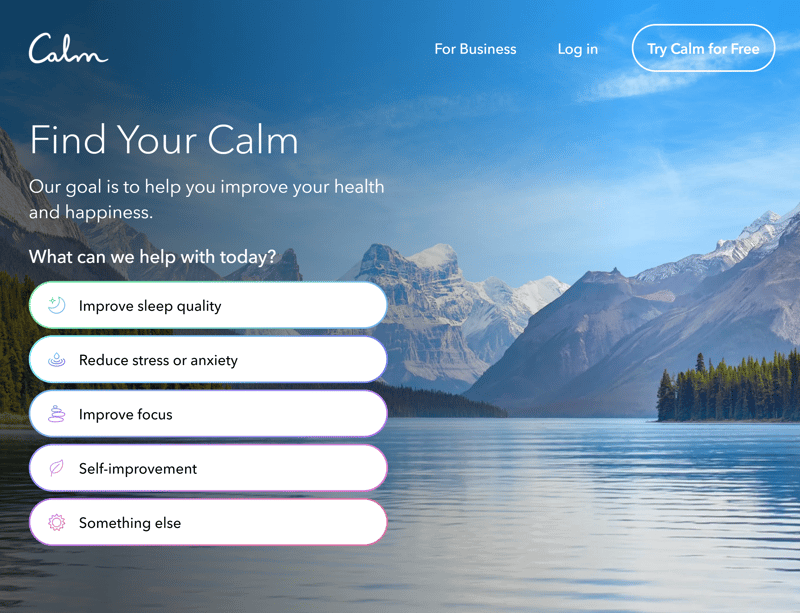
Calm, a sleeping app, has a tranquil landing page that appeals on an emotional level to visitors. The survey immediately shows which problems Calm can help its users overcome.
However, landing pages can be used in many other areas as well, such as:
Product launches or sales
Lead generation
To sell services
To arrange preliminary discussions
Newsletter signup drives
To gather relevant user data
Giveaways
How to Make a Good Landing Page: 8 Important Elements
The motto "less is more" also applies to landing pages: At the end of the day, anyone who's interested in a particular product or service needs to be able to purchase or take advantage of it fairly quickly. If there's too much information on the page, prospective customers will lose patience and give up.
Again, there's no such thing as a "magic recipe" for a landing page, however, there are some basic do's and don'ts, which we've summarized below. The most important thing is to make sure that the landing page communicates what is being sold.
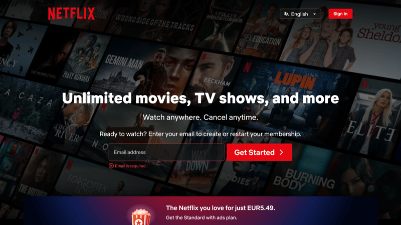
Netflix's landing page immediately gets to the point about what the service offers.
These eight elements should always be on any landing page:
Headline
Just like in a newspaper or magazine, a landing page's headline needs to be clear, informative, and concise. It appeals directly to the visitor and should directly communicate your offer. Let visitors know what you can do for them or which problems you're able to help them solve: After that, they'll be able to quickly decide whether your offer appeals to them.
Get to the point and restate the message that got them to your landing page in the first place. Sentence structure and wording matter, since visitors generally only read the first and last words of a headline.
You can add a second headline immediately under the first one to emphasize your product's advantages or benefits.

Visitors to Jimdo's landing page immediately know that the service can help anyone build a website.
Headline Checklist
Headline and subheadline are centrally placed in the upper part of the screen, highly visible, and mobile friendly.
The headline is short and snappy: It communicates your product or service and the page's focus.
The (optional) second headline details your product's benefits.
Hero Shot
Another key element of a landing page is the so-called hero shot. This image serves as the visual focus of your landing page. It provides the explanatory and emotional parts of your message and should harmonize with your headline.
Refrain from using slideshows or videos. The average visitor will need too long to connect its visual clues to your overall message.
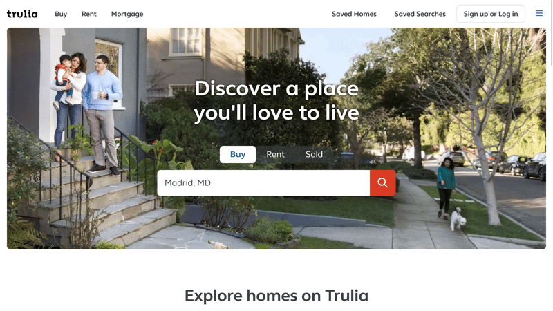
Trulla is a real estate website that uses its landing page's hero shot to communicate the emotional aspects of its business.
Hero Shot Checklist
Your product or service is clearly shown in the proper context.
The image isn't distracting and doesn't move. The file size is small enough that it doesn't negatively impact your page's loading speed.
The headline and subheadline are easy to read, even when they're displayed against the hero shot.
Content: Product Description
Did your headline grab your visitor's attention? Great! Now, it's time for your content to take over and confirm whatever your headline promised. Proactively answer any questions you think your prospective customers might have.
Don't forget: You want to solve a problem your visitor is having, not show off how wonderful your product or service is. Let visitors to your landing page know why they should take advantage of your offer.
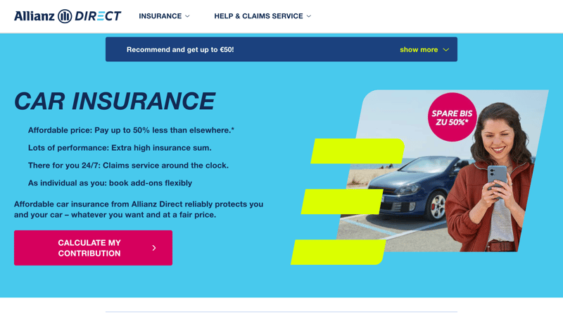
Allianz, an insurance company, doesn't pull any punches with its landing page. Its content clearly shows which problems they can help their customers solve.
Content Checklist
The content keeps the headline's promise.
Content is only king if it's relevant, interesting, and legible.
Don't describe how wonderful your product is: Focus instead on which problems it will help visitors solve.
Communicate Benefits
Have you already described your product in the content section? That's okay, you can use this part of your leading page to briefly summarize these in keyword form. If, on the other hand, you used the content part to guide visitors to your product, now is your chance to go into more detail. Don't write a novel, but instead provide short, snappy, and informative bullet points that encapsulate what you have to offer.
Briefly state the advantages of your product or service and how you'll cater to their needs. Arouse interest and encourage visitors to become your next customers!
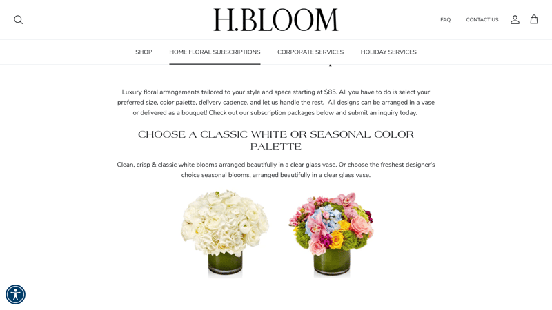
H. Bloom's floral arrangements are so captivating that users gladly lose themselves in the accompanying text.
Benefit Communication Checklist
Describe the kind of problems that your product/service can solve.
Clearly summarize your product or service's advantages.
Call to Action
Now that you've made it clear to your visitors why your offer is unbeatable, it's time for your landing page to generate leads. The easiest way to do this is with a call to action (CTA) button. This converts interested visitors into prospective customers. A simple contact link or page isn't enough. Instead, carefully design your CTA, paying close attention to its colors, shape, and accompanying text.
Your CTA should convince those who are interested to take a particular action. Some common formulations include "Secure your gift now!" or "Get a free estimate!" A CTA can also motivate visitors to take a particular action, such as signing up for a newsletter, downloading a white paper, or participating in a survey. However you write it, make sure that your CTA is friendly, inviting, and clear.
CTA Button Checklist
Your CTA button can be easily distinguished from the other landing page elements (different color).
Your call to action is polite and straightforward with a clear prompt.
Your CTA button has a uniform look, even if it appears in several places on your landing page.
Form
While your CTA prompts visitors to take a specific action, a contact form offers visitors an alternative way to get in touch and follow up with you about your products or services. This is important, especially for anyone who has additional questions or wants to know something else before making a purchase or signing up.
Providing contact details also enhances trust: It signals that there is someone on the other end who is ready to listen/communicate, without any money changing hands. Of course, this only applies if you or your team carefully address all queries. In addition to a contact form, you can include a live chat staffed by you or your team.
Social Proof (Ratings, Testimonials)
If customers have had positive experiences with your product or service in the past, show these off on your landing page. Satisfied customers are just about the best reference there is, so make sure that you integrate their ratings from Google or other websites.
However, you should only use verified reviews. Fake ones will be quickly found out and have the opposite effect on your business, likely ruining its image and your reputation.
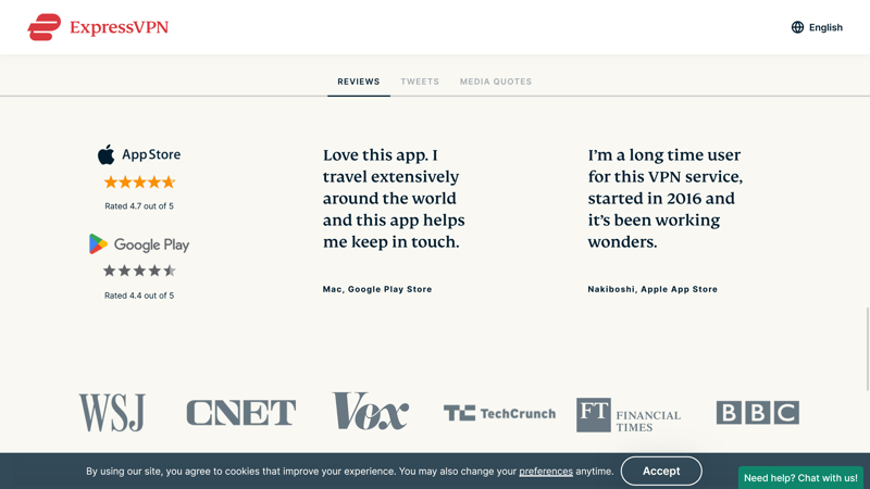
Real ratings and reviews, like those for ExpressVPN above, are valuable since they show prospective customers what to expect!
Trust Elements (Seals, Certificates, and Awards)
Have you or your products won any awards? Were they chosen as the 'best of' in a particular survey or review series? Do you have any official certifications? If so, flaunt the recognition of your excellence/quality on your landing page. For digital certifications or awards, make sure that the seals are genuine and that you're recognized as an expert within your branch or niche.
How Do I Make a Landing Page?
There are many different ways to create a website, such as a landing page. You can hire a freelancer or an agency. Both have the experience and know-how to create a landing page for you. However, if your budget is smaller, you might want to consider a design service.
Another option is to build a landing page on your own, so long as you have the patience for it. This can be done with dedicated landing page builders, website builders, or even email marketing programs. We've summarized the benefits and drawbacks of each approach, along with other landing page tools for you here.
Conclusion
A landing page is a special kind of website that directs attention to a specific offer, product, or service. It's often used in online marketing campaigns and is where visitors "land" after they click on an ad banner or link, such as in an email, social media post, or newsletter.
You can easily create a successful landing page, especially if you pay attention to our eight tips above. Focus first on your concept, and only then worry about its design and content.
FAQs
A landing page is a special kind of website that focuses on a particular product or service. It has a clear target group and encourages visitors to take a particular action, such as subscribing to a newsletter or purchasing a product.
There are many different types of landing pages, which differ largely in terms of their targets. One popular goal is lead generation, which refers to email addresses, contact data, or Facebook Messenger information. There are also click-through landing pages, which are commonly used in ecommerce to funnel visitors towards a product or service, as are sales landing pages, which generate purchases.
You can make a landing page with special tools, a website builder, or email marketing software. Alternatively, you can hire a freelancer, an agency, or pay a website design service to set up a landing page for you.


