Create a Professional Website: Here's How
If you're self-employed or run a business, your website is your digital storefront. This is where people find you and where you can show who you are and what you offer.
A business website isn't a hobby project, so you can't treat it casually. Visitors judge how professional your business is by how professional your website looks.
But what makes a website "professional," and how can users with different budgets, design skills, and programming knowledge create a professional website? We'll show you what a professional website needs and how you can create one.
What Makes a Website Professional?
To create a professional website, you first need to know who visits your website and what you want to achieve with it. Your purpose and target audience are key factors that shape the basic structure of your website. Start by asking yourself these questions:
What is the goal of my website?
What type of users will visit my site?
What are the reasons potential customers come to my site?
What are the reading habits of my future visitors?
What do other companies in my industry or niche offer?
What are my own expectations for my website?
Your answers to these questions should give you a first idea of what you and your potential visitors expect from your website. What makes it "professional" also depends on the type of website you're creating.
Different Types of Websites
There are several basic website types that determine what features and content visitors expect. The most important ones are:
Professional Business Website
If you want to tell the world and potential customers about your products, services, offers, and jobs, you need a business website. You can create anything from simple one-pagers to complex multi-page websites. Remember that the bigger your website gets, the more rules you need to follow to keep it looking professional.Professional Blog
Blogs need quality content and regular updates. To make your blog look professional, make sure your articles are well-formatted and easy to find with good organization.Professional Online Store
If you want to sell products, you need a website with an online store. Being professional here means clearly explaining your shipping and payment terms, and making sure your checkout works perfectly.Professional Portfolio
To show potential customers what you can do and what you've done for other clients, you can showcase your past projects on a portfolio website. Make sure to organize your projects into clear categories and link them to specific clients, companies, or industries.
No matter what kind of website you're creating, there are some basic things you need to keep in mind to make it look professional.
4 Key Aspects to Consider
There are four main pillars that make a website professional:
- 1.
Design
- 2.
Content
- 3.
Technology & Infrastructure
- 4.
Legal & Security
Let's look at all four categories and show you specific examples of what makes a website professional.
Design
One look, one click: First impressions matter - and online, people make quick decisions. If users don't like what they see on your website, they probably won't come back.
Good design can show potential customers right away if your business is worth their time. Here are some key design points you should definitely keep in mind:
Colors
Choose the right color combinations to visually captivate your website visitors. Your colors should work well together and ensure that text and other elements remain easy to read. A good rule to follow: Less is more - too many colors on screen can quickly overwhelm viewers.
Of course, your color choices should match your brand identity. If you have a company logo, it's a good idea to use its colors and elements throughout your website, just like HubSpot does:
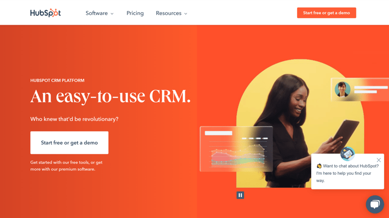
White with orange tones: HubSpot's color scheme is simple and easy on the eyes.
Picking the right color scheme is an art in itself. You can also think about how different colors and combinations affect people psychologically.
If you're creating your website using a design template, for example with a website builder (more on this later), you won't have to choose colors yourself - you can use pre-made, matching color palettes.
Text Structure & Fonts
The "less is more" rule also applies to fonts. To avoid confusing readers, use no more than two or three different fonts, ideally in no more than three different sizes.
Make sure your text is easy to read and well-structured. For example, with main headings, subheadings, and body text.
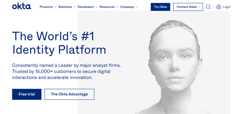
Don't overwhelm website visitors with too many fonts or too much text. Okta gets everything right here.
Especially on your homepage, avoid hitting visitors with long blocks of text. Instead, share the most important information in easy-to-digest chunks.
Images, Graphics, and Animations
Whether it's product photos, illustrations, or portraits, poor quality and unprofessional images immediately stand out in a bad way.
That's why it's worth investing in good photographers or designers or getting high-quality material from stock photo platforms. Your images should have high resolution and match your website's theme.
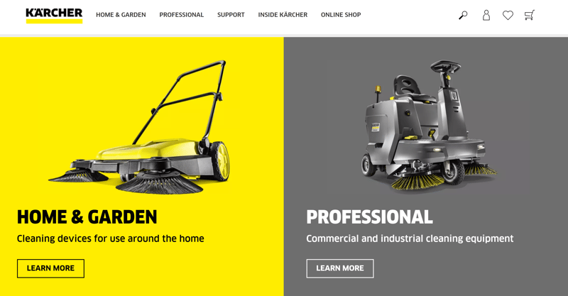
The cleaning equipment manufacturer Kärcher shows a selection of products on their homepage that link to product categories.
Every visual element, whether it's a graphic or photo, should add value. On a website, this can look like showcasing a product or telling a story.
Organized Menu and Layout
A professional, well-organized menu is key for easy website navigation. Your visitors should quickly understand where to find content and reach important information with just a few clicks.
For example, on OTTO's careers page, job seekers can find links to all important sections right in the navigation menu of the homepage:
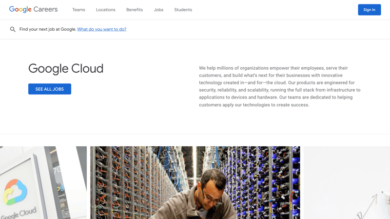
Good and logical navigation is especially important on career pages so potential applicants can quickly find all essential information.
The rest of your website should follow your navigation menu's example in terms of clarity and visual hierarchy. Put detailed descriptions on subpages and keep the essential information on your homepage.
A grid-based layout divides your website into columns and sections, which creates a balanced reading flow.
Logo
A logo is your company's visual business card. A good logo sticks in people's minds, but creating one isn't easy. That's why it can be worth having professional designers create it for you. They'll design your logo while considering your corporate design and other requirements.
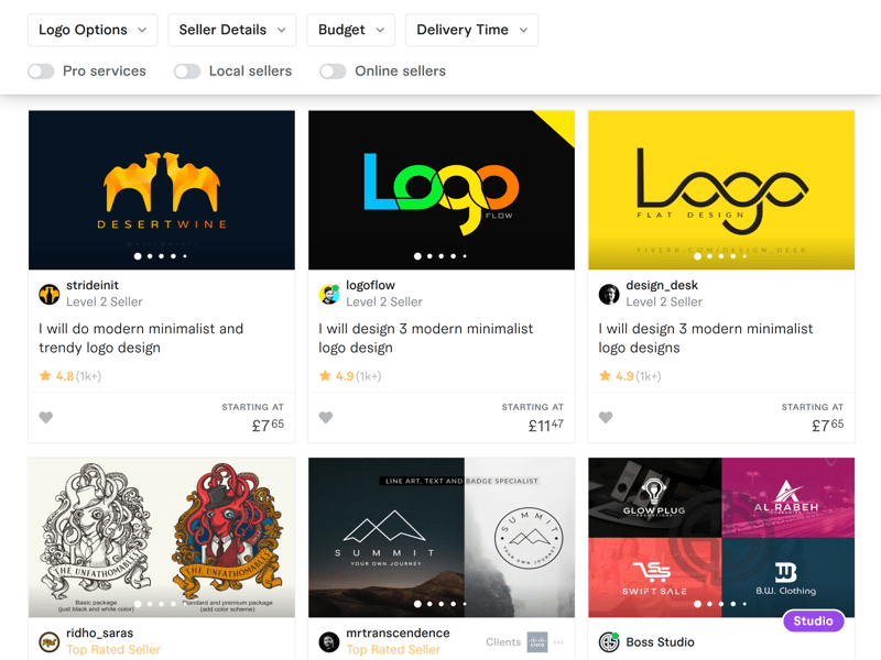
You can find logo designers at different price points on freelance platforms like Fiverr.
Don't have a budget for professional designers? You can create simple and temporary logos using affordable or free logo makers.
Content
While good design is immediately noticeable, content quality reveals itself over time. You need great content to back up the good first impression your design creates. Here are some key aspects to keep in mind:
Outstanding Content & USPs
To stand out from your competition, you need to clearly define your "Unique Selling Point" (USP). For your new website to succeed, you need to offer something valuable that isn't available anywhere else (or that you present in a particularly compelling way). This could be a unique writing style or a service that's not yet available in your area.
Finding a topic niche that nobody writes about yet can also make your site special. Parkerlebnis.de is a good example - it's a website that focuses only on theme parks:
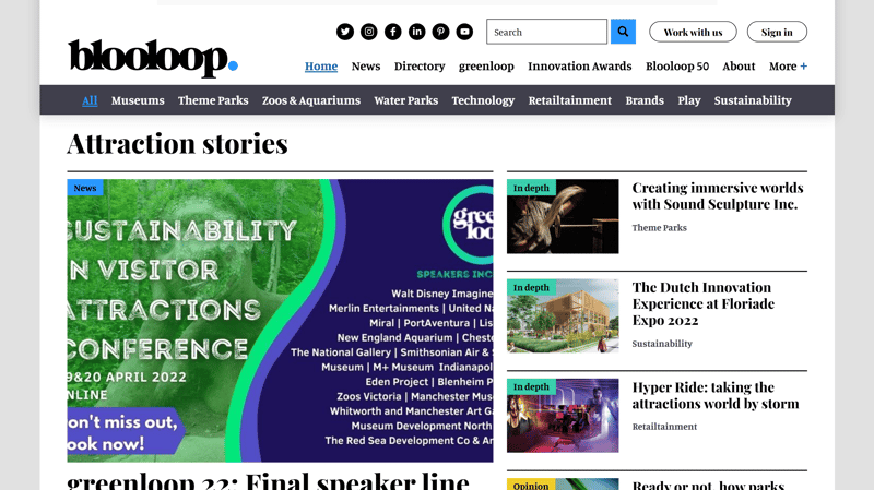
Parkerlebnis focuses on amusement parks.
Your content doesn't have to be completely "unique" - after all, everything has been done before on the internet. You can still be very successful in a crowded niche as long as your content quality is high.
If you provide well-written, meaningful content that can compete with the current top performers (the ones showing up first in Google searches), people will see your website as professional.
What makes content "professional" depends on your type of website. Here are some mistakes you should always avoid in your content:
Spelling mistakes
Poor writing style (lots of repetition, technical jargon, etc.)
Content without clear value
Outdated information
SEO
SEO stands for Search Engine Optimization. It improves your page's ranking in Google searches. The higher your page appears, the more views your website gets.
A good position on Google is basically proof of high-quality content, since Google's algorithms have gotten pretty good at finding content that's valuable for users.
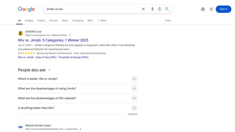
EXPERTE.com articles often appear as the first result or on the first page of Google search results.
Every website owner should follow some basic SEO rules. Use relevant keywords in your website content that your target audience searches for, and make sure your page speed is optimized. You can find a helpful SEO checklist at Squarespace.
Target Audience Communication
Before creating your website, you should have a clear idea of your target audience and purpose. Keep your audience in mind when creating content. How old are your readers? Is your service budget-friendly or high-end? Are you targeting local or international customers?
If you don't communicate with your website visitors in the right way, you'll come across as unprofessional - like you haven't done your homework. Make sure your content matches your target audience and consider their behaviors and preferences.
Strategic Content
With Google Analytics and other analysis tools, you can evaluate your website content. You can see exactly which content performs well and which doesn't, and adjust your strategy accordingly.
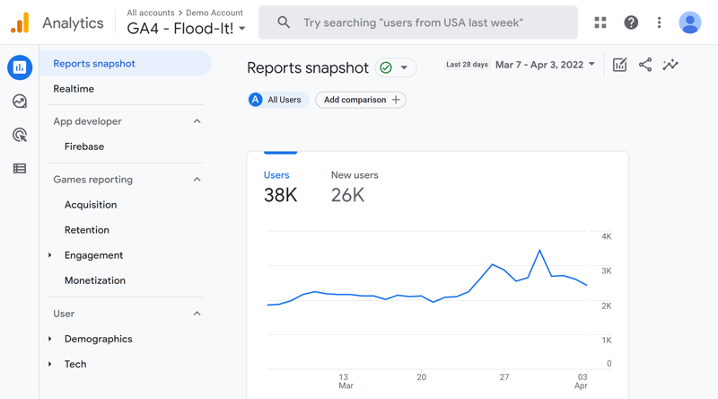
Google Analytics helps you learn more about your visitors.
Based on Google Analytics insights, you can better understand your visitors and provide professional content that meets their needs and expectations.
Regular Content
The internet moves fast, and today's fresh content might be outdated tomorrow. For blogs and news sites, keeping your content current is key to success. Search engines also like fresh and regularly updated content, which helps boost your ranking.
If your newest articles are several weeks old or your website information is outdated, it can hurt your website's professional image.
Don't Overdo Advertising
While ads on your website might help your bottom line, they can test your visitors' patience. Be careful with ads and make sure they don't ruin the user experience.
Your ads should match your website's tone and mission: For example, a Facebook ad on a website about online privacy goes against the "brand" and looks unprofessional.

Tabloids like the Daily Mail often show more ads than facts. The number and quality of ads don't help create a professional image.
Full-page pop-ups or ads for shady offers (like casinos) look especially unprofessional.
Technology & Infrastructure
It's not just about having a nice frontend - your website needs to perform well under the hood too. Every site needs to meet some basic technical requirements to look professional:
Fast Loading Times
The average loading time for mobile websites in the US is 22 seconds. One-third of users leave your site if it takes longer than three seconds to load. Keep an eye on loading times, especially if your website contains lots of images, graphics, or videos.
Your website's loading time is also known as page speed. It's important not just for making your website look professional, but also for good Google rankings. You can check your website's speed with the EXPERTE.com page speed test:
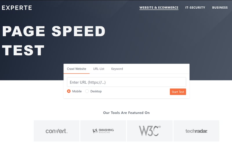
Use EXPERTE.com's page speed test to find out how fast a website loads.
Want to improve your page speed? Read how here:
Mobile Optimization
If you ignore your mobile readers, you might disappoint a large part of your potential customers: More than 50 percent of internet traffic now comes from mobile devices.
Text, products, tables, and images need to be easy to read on smartphones, because poor mobile optimization looks unprofessional. Luckily, most website builder templates today are mobile-friendly by default.
Custom Domain
If you want your website to look professional, you should have your own domain.
Nothing looks more unprofessional than the ugly subdomain of a free website builder. For example, with Wix, you can publish your website for free, but it will only be accessible through a domain with "wixsite" in it. This unattractive addition stands out right away and is only suitable for hobby projects.
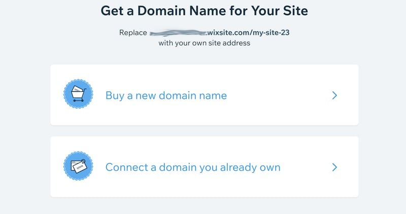
Website builders like Wix offer free plans, but you can't choose your own domain name.
Luckily, you can get custom domains for just a few dollars per year. Here's everything you need to know about domains and a comparison of the best providers:
Legal Requirements & Security
As a website owner, you have certain legal obligations that you can't ignore. Even in areas where it's not legally required, you should take your visitors' and customers' security and privacy seriously to make your website appear trustworthy and professional.
SSL/ HTTPS
Website visitors can tell how secure their data is on your site with just one look at the address bar. Only pages where the URL starts with https:// show the lock icon in the top left, which guarantees a secure connection.
HTTPS is a security protocol that proves there's a secure connection between the server hosting the website and the browser visiting it. This protection is verified by an SSL certificate.
You can get SSL certificates directly from certification authorities, and many hosting or website builder packages include them automatically. Free SSL certificates are also available.
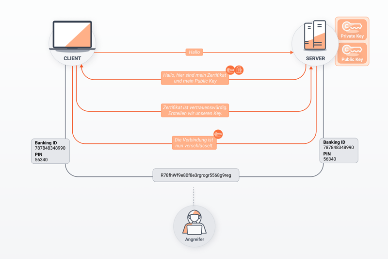
This shows how SSL encryption works between client and server, making sure no one else can see the messages.
If you run a professional website, you need to take visitor security seriously. You can check how secure your website is with the EXPERTE.com Security Check.
Copyright
To avoid copyright violations, you need to credit some images, graphics, and videos with their sources. However, there are stock photo platforms like Depositphotos where you can download royalty-free photos. The prices vary depending on quality and subject, and some are even completely free to use.
Having source credits scattered all over your website can look unprofessional. It's best to use stock photos that don't require crediting the creator.
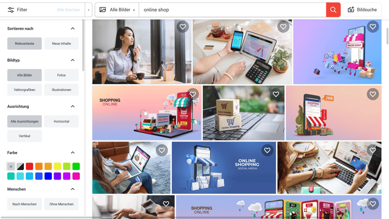
Stock photo providers like Shutterstock or Depositphotos offer images and videos for your website.
Of course, you can't steal text either: plagiarism isn't a minor offense - it could get your website shut down. When using information directly from other sources, you should include it as quotes and mark them accordingly.
You can quickly check if your content is unique using plagiarism tools like PrepostSEO.
Legal Notice
In the US, websites are legally required to have an impressum. An impressum is not just important for making a professional impression - it's actually required by law.
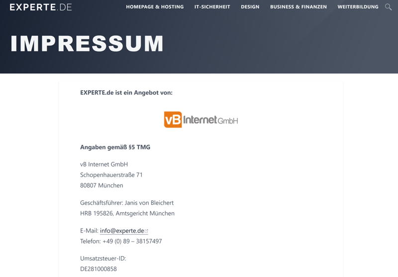
Your website must include an imprint.
The information you need to include in your imprint depends on your website's content. At a minimum, you need to include your contact details, professional information, and your company's legal structure.
Privacy Policy
If you collect or process personal data, you need a privacy policy on your website. You should clearly explain how you and/or your website operator handle personal data responsibly, and tell visitors exactly if and how you use their personal information.
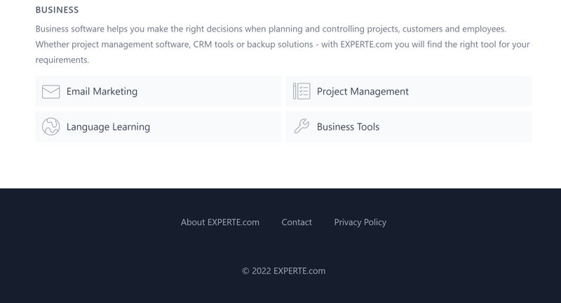
You'll usually find the privacy policy in a website's footer. That's where visitors will look for it first.
Ways to Create a Professional Website
Now you have a checklist of things to consider when you want to create a professional website. You can plan for many of these aspects early on, but things get real when you start working on your website's design and layout.
How you put this knowledge into practice depends on which method you choose to create your website. There are three main options, and we'll look at the pros and cons of each one.
Code Your Own Website
To code a website yourself, you need three things: programming skills, a content management system (unless you want to code the backend yourself) and a hosting provider that provides online storage space for your site.
When it comes to making your website look professional, you're on your own: You need to handle everything from design to technology and security yourself, or outsource these tasks to service providers.
Advantages
Flexibility: When you code yourself, you have complete freedom, independence, and total control over the design.
Features: You can create features that a programmer might not understand or a website builder can't offer.
Design: Your creativity is your only limit when coding your own website. You don't need to constantly check with programmers/designers or stick to website builder templates.
Disadvantages
Experience: You might need to learn everything from scratch: You should either already know HTML, CSS, and FTP well - or have time to learn them. For beginners, it's hard to match the professional results of experienced website developers.
Time and effort: Even with experience, it takes a lot of work to code a professional website from scratch and cover all important aspects.
Hiring Someone to Code Your Website
If you can't or don't want to code yourself but still want complete flexibility, you can hire someone to create your website. There are many service providers online who can build a professional website for you.
Here are some places where you can find help:
While these platforms have many low-cost freelancers, quality comes at a price. To make sure freelancers take time with your website and consider your specific needs, don't just look at the price. Poor work often leads to unprofessional results.
Agencies
Agencies usually cost more than freelancers but offer more expertise. You're not tied to just one person or need to split tasks between different freelancers - instead, you can work with talents who have different specialties.You can find the right agency through search engines or comparison websites. On EXPERTE.com, we've put together a list of ecommerce agencies.
Advantages
Flexibility: With the right external support, anything is possible as long as you have the budget and can clearly communicate your needs and wishes.
Choice: There are countless freelancers and agencies online. You'll likely find the right person and offer for your project.
Point of contact: You always have someone to reach out to with questions and requests.
Disadvantages
Cost: Good service providers know their worth and charge premium rates. A professional website typically costs between $2,000 and $100,000.
Quality: Results can vary greatly between freelancers and agencies. Communication issues might also lead to you paying for a website that doesn't fully meet your expectations.
Website Builder
A website builder lets you create a professional website without any coding or design skills. You can visually design pages using features like drag-and-drop and add content intuitively.
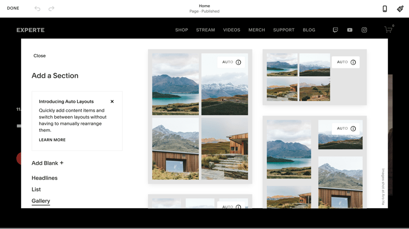
With website builders like Squarespace, you put together your website using pre-made sections and content elements.
Website builders automatically handle many aspects that make a website look professional, such as mobile-friendliness, SSL security, and matching color schemes.
However, because they focus on ease of use, website builders are much less flexible than other methods, and you're limited by each platform's rules and restrictions.
When it's obvious that a website was made with a website builder (for example, because it looks very similar to other sites using the same template), it might hurt its professional appearance.
Advantages
Beginner-friendly: You don't need any programming or design skills to use website builders.
All-in-one: Everything you need for a professional website comes in one package - from hosting and domain to advanced features like ecommerce and marketing tools.
Price: Website builders are relatively affordable.
Disadvantages
Limited customization: Website builders offer less flexibility for customization compared to other methods.
Technical limitations: Websites built with website builders often fall short in areas like SEO and loading speed.
Cookie-cutter design: Due to pre-made design templates and content, websites created with builders can look very similar.
EXPERTE.com's Top Website Builder: Wix

In our EXPERTE.com website builder comparison, we tested 15 popular platforms. Wix came out on top by combining a wide range of features with easy-to-use controls, striking a great balance between depth and simplicity.
Wix offers solid designs and lets you move page content freely with drag-and-drop. It includes a powerful marketing platform, and you can find many additional features in its extensive app market.
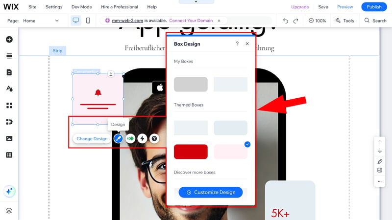
Wix is EXPERTE.com's top-rated website builder.
If you want to try Wix for free first, you can use the free version of the platform, which links your website to a Wix domain and comes with some other limitations. For an ad-free website with your own domain – a basic requirement for any professional project – prices start at about $12 per month.
Conclusion
Now you know what to consider when creating a professional website. Our checklist, divided into four categories - design, content, technology & infrastructure, and legal & security - helps you create a website that your visitors and potential customers will see as professional.
You have three main options to build your website. You can code it yourself if you have the necessary coding and design experience. This gives you unlimited flexibility, but you'll need to make sure you meet all professional standards on your own.
If you have the budget and don't want to code yourself, you can hire freelancers or agencies to create your website.
Lastly, you can use a website builder, which offers less flexibility and customization but makes it easy to create a professional website, even for beginners.


