Whenever you see four overlapping, interlocking rings or an apple with a bite mark, it's likely that you'll quickly think of Audi or Apple. That's precisely what all strong brands have in common - they're immediately identifiable. To achieve this level of brand recognition, companies need an unmistakable, clear, and compelling appearance. But these rules don't just apply to a brand's logo. Instead, the entire corporate identity must be clearly defined in terms of typography, wording, imagery, and color palettes.
The overall visual appearance of a brand should be laid out in a "style guide". This manual details a company's corporate identity (CI) and corporate design (CD). It also defines the business's online presence, content elements, and other visual features, explaining why specific colors and fonts were chosen. Simply put, a style guide is a rulebook that specifies how a brand should be communicated.
What Should Be Included in a Style Guide?
Building a style guide is a creative and challenging task. It can take time—and for good reason since the results determine how the public perceives your company. The more consistent a brand appears, the more trust it creates. Accordingly, your style guide should be able to provide answers to these important questions:
What is our story?
What are our goals?
Who is our target audience?
What problems does our product/service solve?
What are our company's core values?
How do we differentiate ourselves from the competition?
A style guide converts the answers to these questions into standards for your brand's identity. These can be broken down into the following categories: core brand & target audience, logo design, color palette, typography, web presence, imagery & graphics, and wording & tone.
Core Brand & Target Audience
Whether you're managing an established business or a startup, brands develop personalities based on their philosophy, character, and history. So, what are your company's core values? What does the business hope to achieve?
The answers to these questions comprise your brand's story. This should be told earnestly, but not without a good measure of humor or lightheartedness. Determining the right approach depends on your company, its products, and last but not least, your target audience. After all, they're the ones who will be purchasing your product, so make sure that your brand meets their expectations.
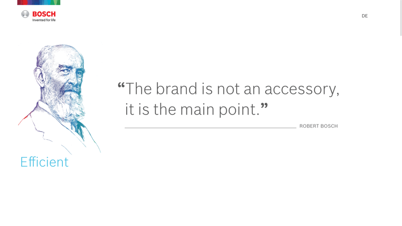
Bosch succinctly presents its corporate values, mission, and history, clearly speaking to its tech-savvy target audience.
For example, Bosch, a technology company, appeals to a tech-savvy target audience. The brand aims to stand for quality and sustainability, so a playful description of its visions and values would be out of place.
Things are a bit different at Skype as they express their company history and goals in a lighthearted way while still appearing sincere. In light of the product they offer, color and humor aren't out of place.

Skype outlines its corporate mission in a colorful and humorous way.
A company's history, goals, and mission statement lay the groundwork for its style guide. The more effort you put into this first step, the easier it will be to develop visual and communication elements, such as your company slogan.
Logo
While your brand's history and values can be broadly formulated, the exact opposite applies when it comes to your company's logo. These should be compact, to the point, and unique. Ideally, your brand should be instantly recognizable. Be sure to consult our comprehensive EXPERTE.com guide to choosing a logo, which includes recommendations for the best tools to create one.
Your company's logo will be one of its most important marketing tools, so it's vital to pay close attention to how it's presented and used. Specify these details clearly in your style guide. Otherwise, you may find your logo being published in wild color combinations or used incorrectly by unversed employees. When a company's logo is distorted, the brand's credibility suffers.
The importance and strong linkages of logos with brand names make them subject to special trademark protection—as long as they've been registered by the owner. Check local regulations to find out where to register your company logo. An application to protect your logo internationally must be submitted to the World Intellectual Property Organization (WIPO).
The more precise you are, the less the risk is that your logo will be misused by other agencies (or even your own employees). Similarly, by being as accurate as possible, your company will have a consistent appearance to the outside world. With that in mind, your style guide should specify:
Size
Proportions
The color palette and inverse image
Amount of white space
Font (for any text)
Different background variants
"Don'ts", such as distortions, or color and text combinations
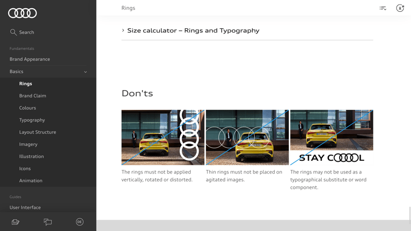
Audi doesn't just detail how its logo should appear; the company is also very clear about how it should not be used.
As an example, Audi dedicates a large portion of its style guide to the company's logo, clearly outlining how it should and should not be used. These specifications don't just apply to the rings themselves, but also to where the logo can be placed in advertisements, in what thickness the rings can appear, and how they can be trimmed.
Color Palette
Colors play an important role in a brand's design. They strongly influence how a company is perceived and what kind of associations people make. For example, a cheerful yellow is inappropriate for a funeral home, and black isn't ideal for a wedding dress manufacturer. Banks, clinics, and companies providing financial services often choose blue, which stands for seriousness and reliability. Red is very dynamic. Be careful using orange on a large scale—it has a tendency to look cheap. Your color choice should heavily depend on the kind of atmosphere your company wants to create and how you want your target audience to feel about your brand.
All colors should have a particular role
Your brand's primary color will be its most distinguishing feature; it's most commonly used as the main color in the company's logo. The secondary color either creates contrast or harmonizes with the primary color. A highlight color should be reserved for anything you want to emphasize, while the text color should be chosen with legibility in mind. Your style guide should not only define these colors, their possible combinations, and uses, but also the color values to be used on the web (RGB, hexadecimal values) and in print (CMYK, Pantone).

The IT giant IBM's style guide specifies exactly how its blue and gray corporate colors can be used.
The closer you link your brand to a specific color combination, the more precisely your style guide should record how these colors are to be used. This should entail both descriptions of how the colors are allowed to appear, as well as examples of "don'ts".
Carefully consider your color combination
The possibilities are endless; you can choose anything from bright colors to a subtle monochrome scheme. However, it's important to keep your target audience and corporate philosophy in mind when selecting your company's hues. A style guide can also explain the reasoning behind the choice of particular colors, which makes it easier for internal and external parties to understand its color palette and use it properly.
Typography
Typography is another important aspect of a coherent corporate identity. The right lettering helps convey your brand's message to the world. Consider that each font has its own character traits and can generate varying emotions. If the typography matches your brand, logo, and target audience, no one will give it a second thought. However, if there is a major mismatch or if the lettering is difficult to read, it can damage people's overall impression of your company.
Your style guide should define the primary, secondary, and highlight fonts, as well as their size and line height. It's also advisable to include specifications such as line spacing, text length, alignment, and backgrounds. Set email or presentation templates are also great for maintaining brand uniformity when interacting with potential clients or customers.
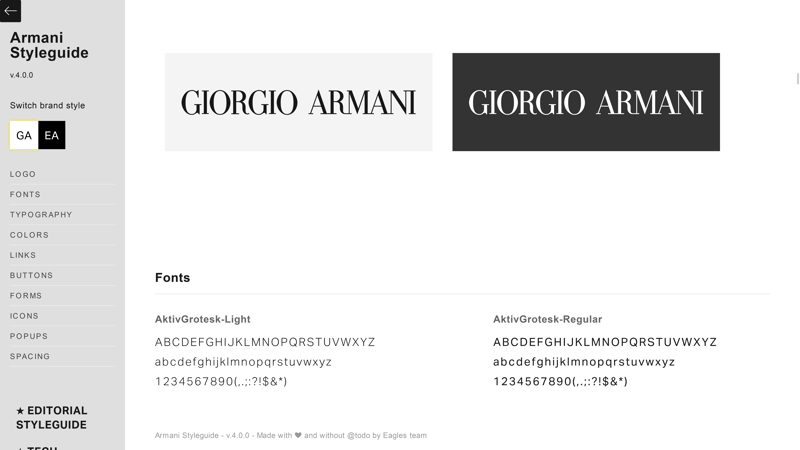
Armani Group uses different font combinations for their various product lines; all details are clearly specified in the company's style guide.
Interface
Today, it's vital for brands to have an expansive online presence that's both user-friendly and appealing. Style guides define these two factors as user experience (UX) design and user interface (UI) design. UX design, for example, ensures that a hyperlink is recognizable as such, while UI design might pay attention to whether visual aspects accurately convey a brand's messaging.
A style guide spells out exactly how colors, animations, icons, text, buttons, and links should be used. These specifications make for successful collaboration between programmers, designers, and content editors, especially when it comes to large websites.

Cobo, a global leader in plastic injection molding for footwear, has a very impressive website.
Impress your visitors
Cobo, a market leader in plastic injection molding for shoes, has an innovative website that shows just how creative and user-friendly an interface can be. The company's usage of rubber is referenced stylistically across its website, ranging from decorative menu elements, to animated images, to screen transitions between its products. Cobo's corporate website was designed to surprise and delight users without overwhelming them or making navigation difficult.
Images & Graphics
Imagine Santa driving a sleek car through a modern urban landscape at dusk, holding a huge burger in his hands. Your brain would likely be unable to determine what sort of advertisement you were experiencing. This is because Coca-Cola, major car companies, and fast-food giants all have something in common: they've defined a precise visual language that ensures immediate brand recognition—even before a logo is shown.
A style guide should specify which message a company's visual language intends to convey. The more precisely you define the mood lighting, motifs, atmosphere, color tones, and location, the more clearly the brand will be represented, and the easier it will be for customers to identify with the company and its images. The same rules apply to icons, infographics, and drawings.

When you see a gorgeous alpine panorama with purple accents, you can be sure that it's Milka advertising their famous chocolate.
Tone
In everyday conversation, a person's tone can be even more important than their choice of words. The same applies when communicating with customers, prospects, followers, investors, or suppliers. Your corporate voice should be unique and match your brand. Its tone can be anything from funny to serious, alternating between inspirational, soothing, or challenging. There are two important factors to keep in mind when it comes to your company's tone of voice though: The chosen language must be applied consistently, and it must not promise anything that the brand cannot deliver.
IKEA is an interesting example. The company's casual tone reflects its corporate philosophy and approach to customer communication. Compare this to a premium car manufacturer like Audi which emphasizes its serious, cultivated, and elegant brand language. Style guides can also lay out regulations for wording, including specific terms that are and are not to be used.
The Style Guide Creation Process
Before you begin creating your style guide, take a long look at your brand. Consider its core values and style, and make a list of all the aspects you'd like your guide to define. If you have a retail company, you can include things like packaging guidelines and shipping processes. It's also worth brushing up on what your most significant competitors are up to—both for inspiration and to determine where you stand. Once you've laid out the individual components of your style guide and identified your brand's core, it's time to get started.
If your company has been in business for some time, review all your existing communication materials and integrate any elements that have proven successful into your style guide.
Examples of Well-Known Brands for Inspiration
While every company has its own unique character and needs to find an individual style, it's helpful to get inspiration from successful brands. Audi has a very descriptive style guide that articulates its most important brand communication elements in a way that's both coherent and stylish.
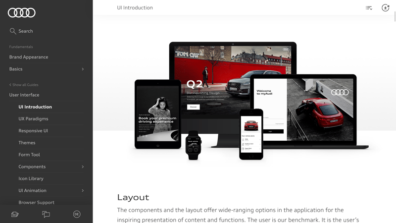
Audi's style guide, available online, is a textbook example of what a company should look at when defining their brand's identity and visual appearance.
The International Red Cross and Red Crescent's style guide can also be found online. Their guide clearly and concisely lists information regarding the correct use of the organization's emblems and logos.

Style guides aren't just for companies; city councils and tourism associations also use guides to ensure visual uniformity. For example, here's the style guide for the City of London.
Tools — Create Your Style Guide With These Tools
There are helpful tools available for those who want to create a style guide themselves. If you already have a company with a website, Stylifyme will display a rough overview of its typography, colors, and image sizes.
While this online style guide generator can be helpful, it can only do so much. Creating a guide involves getting to the root of a brand's philosophy and goals, so the process cannot be entirely automated. After all, the result should be appealing to real people. That being said, you can use tools such as Canva, Frontify, or Styleguide Generator to make sure that your findings are codified in an attractive way.
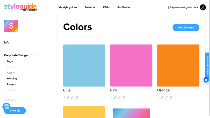
Style guide generators are helpful tools. Simply upload your company's most essential communication aspects to create a polished result.
Conclusion
The concept of "one company, one voice" should apply to every business, whether it's a global corporation or a local start-up. Style guides clearly establish a company's brand, identity, goals, and personality. This ensures that internal team members and external service providers alike know how to accurately portray the business's look and feel.
FAQs
Style guides ensure that companies communicate in a clear and consistent manner—both internally and externally. The more precise the style guide, the better employees and associates are able to convey the company's messaging, which helps safeguard the brand.
A style guide should include everything that makes your brand uniquely identifiable. It's a good idea to thoroughly define each aspect, including the company's history, logo, target audience, colors, typography, interface, images, and tone of voice.
If you're just starting out, begin with a detailed analysis of your brand, product philosophy, and target audience. Should you already have a business, gather all corporate communication elements and consider whether or not they match your brand's values and customers. Style guides are best arranged by chapters, featuring examples of what to do and what not to do. Online tools, such as Canva or Fontify, can help in making one.
A company's corporate design defines its visual appearance. This is just one aspect of a style guide, which also establishes the brand's corporate philosophy, history, positioning, values, target audience, and tone.


